

About the Project
We had the opportunity to work with Calgary UX and CivicTechYYC to help establish a social enterprise focused on providing opportunities for underrepresented and diverse communities to make their voices heard through their branding.
Goal
Create a brand that reflects the organization and can attract both clients and those testing the products.
Role
Branding, Design, and Visual Identity System
Tools
Adobe
XD


Adobe Illustrator

Figma

Jamboard

Duration
4 Months
Questions
In order to define the scope of the project, we had to ask ourselves:
1. How do you create an identity around usability testing?
2. How do you create a system for succession be so that volunteers at any skill level can feel like they can get involved?
Challenges
How do we roll out an identity for a group while representing the tenets of accessible design? With no name, how do a group of directors come to a consensus on a name that represents the people of Calgary, without including words that have connotations, such as 'civic' or 'user'.
Solution
Create an identity around the most up-to-date information on accessible design so anyone at any level could understand it.
Design Process
We started by brainstorming ideas for a potential name while consisting polling our team for a name that would work. For some time, the working name was 'Evolve', and so I created some sketches based on what that would look like.
After receiving feedback from the Board of Directors, we further improved them. The name shifted from Evolve to IncluCity - being distinct enough to stand on its own and represent the aim of inclusive usability testing without the need for an acronym.
 |  |  |
|---|
Creative Strategy
Accessibility First
After months of planning, the final name, IncluCity Calgary was selected. Colours and typefaces were selected with Web Content Accessibility Guidelines (WCAG) and designed with colourblindness in mind.
IncluCity Calgary represents an inclusive focused approach for usability testing in the city of Calgary, with a play on the word 'inclusivity'. This appears as our wordmark. Elements that would carry over were the idea of 'dialogue' with a circular, unending motif.
The icon mark of the logo is the 'C' for 'City' which is in the form of a speech bubble. The icon pointing to Calgary emphasizes the importance of hearing from Calgarians to improve the experiences people have with technology.
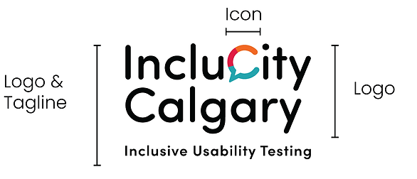
A diagram explaining the components of the final design.


End Results
The Birth of a Social Enterprise
As a result of having a cohesive brand that all members could continuously develop content for, IncluCity Calgary has grown and has a valuation of over $100,000, continues to be featured in the press, with support from institutions such as The United Way.
Let's Connect!
Looking to develop your brand? I would love to hear from you if you would like to discuss more, share feedback or just grab a coffee.