

Question
How can this website be improved for employees to access information more efficiently?
About the Project
We were recruited on behalf of the Department of Transportation (DOT) in California to provide insights on how an employee resource page could be improved for those that work in the Biosciences Department.
**Due to the nature of this project, some content has been redacted**
Goal
Audit and devise strategies on how to better improve the Employee Experience (EX) for the DOT.
Role
UX Audit, Research
Tools
Adobe
XD


Adobe Illustrator

Google
Meet

Duration
1 Month
Solution
Conducting user research about the employees that use the Caltrans website and identifying pain-points that employees had. The project lead provided this insight based on their own experiences, as well as the experiences of others from the biology department, after which, a persona was created.
Testing Environment
Over the course of two hours, the website was explored remotely, with the project lead providing thoughts and insights of previous and current employees, as well as the webmaster.
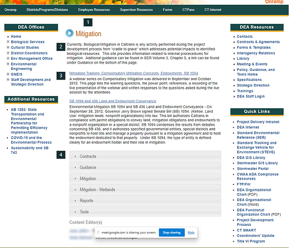
Current Design
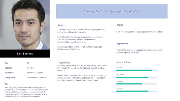
User Persona
After interviewing the project lead and their presentation of the employees' thoughts on the website in its current state, this user persona was generated.
Meet Sam - who wants an employee portal that requires less guesswork. As it is, the website leads to a lot of redownloading of the same files and repetition since instructions are not clear for onboarding.
Other Findings
Given the scope of this work, we recommended to the project lead that user testing among their colleagues to provide more, in-depth feedback from the perspective of Cal-Trans employees.
The project lead identified that the content (outbound PDF links) were to
change, there remains further opportunity to create an optimal, welcoming experience for all employees.
Recommendations
1) Maintenance of a strong, visual language – As the Caltrans public website
has been designed with the user in mind, it is our strong recommendation that the internal webpages be updated to reflect the public CalTrans website (which is WCAG compliant).
-
The use of the play icon in blue has no functionality and does not serve any intended purpose
-
The use of colloquialisms, such as 'cradle-to-grave' should be eliminated
2) Concise Language & Accessibility – The website contains many words
which do not apply to the context of this page. For instance, the word ‘currently’ does not apply as it is not a dynamic website. Consider removing lengthy descriptions for outbound links, and spacing in text that allows for ease of reading.
3) Call to Action (CTA) for New Users – As the second paragraph with the
outbound links containing resources Mitigation Training are intended to provide insights to new users, it is our recommendation that this content be emphasized.
4) Use of Tiles/Alternative Visual Representation – In place of the accordion
menu, tiles may be used instead to represent each of the categories. Vector graphics used on the Caltrans website would be a great addition and would allow for greater brand cohesion.
Conclusion
After presenting my initial findings to the client, we also followed up with a user persona (above), who presented their work to the Head of the Biology Department. The client was satisfied with the work and maintained that the recommendations could be implemented as soon as Summer 2023.